Roles and Time
Overview
NOMAR is a non-profit organization providing a museum, research center, and publication house for New Orleans and the Gulf South Region.
I was contacted by a member of NOMAR to perform a Usability Study, “The areas of most interest to me are discovering the ease of navigation, finding the information desired, and the usefulness of the information posted.”
They were planning on doing a redesign of the website and needed guidance. The scope of the project was a Usability Study and Expert Review.
The stopping point for deliverables was a presentation and report that focused on insights for redesign recommendations.
Objectives
Increase:
-
Ticket Sales and Museum(s) Visitation
-
Membership
-
Events / Exhibitions attendance
Decrease complaints:
-
Not being able to find information on the site
-
Too many steps to get where they need to be on the site
-
Content on site is too wordy and too formal
Approach
The Usability Testing method was chosen by the client. I suggested the Expert Review to complement it (no participants) due to a need by stakeholders to test a lot of pages and features on the website. Also, being a non-profit the budget was very tight. I would’ve liked to explore the site more with a few Information Architecture methods like card sorting, tree testing and/or focus on content inventory / audit.
Stakeholder Interviews
NOMAR has ten departments and the head of each department were included in the stakeholder interviews.
Result of stakeholder interviews provided guidance on ‘Business Goals’ that were then narrowed down to critical tasks for business success.
Do users have difficulty finding information on the web site?
Do users have difficulty understanding the presentation and content of the web site?
Does the website contain major usability flaws that prevent completion of frequent and/or critical tasks for Users?
Tasks for focus:
-
-
Becoming a member
-
Donating money
-
Buying tickets for events and reserving tickets for museum (using myHNOC)
-
Understanding where the museum is located
-
Usability Study
Moderated Qualitative Think-Aloud Usability Study as exploratory ‘Effectiveness’ and ‘Clear and Simple Use’
Three measurements of attitude were also used:
-
Cognitive – System Usability Scale
-
Affective/impression – adjective list
-
Conative – recommending site to others and future use
Expert Review
Customized list of heuristics that fit the website needs were taken from:
-
Government Usability document “Research-Based Web Design & Usability Guidelines”.
-
Usability literature by Dr. Iain Connell at University of York.
Participants, Location, Tools
12 participants – museum visitor, technically savvy, and interest in New Orleans and Gulf South Region
Convenience Sample – Social Networks, Flyers on College Campus and Coffee Shops around the City
Tools: Camtasia and WebCam
Study Sessions: 3 weeks
Recommendations and Quotes
-
(Task 1 – hours and location)
-
Place important items at top center. Users generally look at the top center of a page first. All critical content and navigation options should be toward the top of the page.
-
Participant 7 – “I’d probably just google the place and see if an address pops up”
-
-
-
(Task 3 – become a member)
-
Keep intention of pages distinct. Everything on a page should have a common theme.
-
Participant 3 – “I feel like I’m going in a loop here. I clicked on Support and then the Become a Member link, but I’m now back on the tickets and events page.”
-
-
-
(Task 5 – myHNOC)
-
Clearly explain what the page is about and what to expect when using it. Watch for misleading language in text.
-
Participant12 – “No, not at all, and this, honestly this web page to me doesn’t know what it wants to be…it’s strange that it starts off with it being MINE”
-
-
Allow important information to be visible without clicking into a link.
-
-
(Task 6 – purchase tickets)
-
Relevant information on a page should be grouped and chunked together.
-
Participant9 – “Honestly, this is confusing me. I see I can purchase tickets, but it won’t allow me to purchase more than four. And why am I to “continue shopping” when I’m not really buying anything?”
-
-
-
(Task 7 – readability and content)
-
Keep reading level between 5th – 8th grade.
-
Participant11 – “I have no clue what it’s about. I read that whole thing and I don’t know what it’s about.”
-
-
-
(Task 2 – donate money) and (4 – find event) met success criteria and didn’t require redesign
Conclusion
Participants found the NOMAR website informative, trustworthy, and credible. They were also impressed with the amount of information contained on the website. But, there was an overall disorientation and confusion while using the website.
Participant8 – “I would say that the website is difficult to use, difficult to find what you are looking for, difficult to find details you are looking for but the collection itself has a crazy amount of information which the best thing to do is call them than use the website.”
Major key findings:
-
The location address and hours of operation placement was difficult to find, and participants were often lost on the web site when searching for them.
-
The myHNOC page title was not understood as being the page to find membership information, special events requiring tickets, and how to reserve a spot/ticket to tour the free museum.
-
All participants mentioned being confused, frustrated, and lost when using the website.
-
All participants felt content was unclear and wordy.
-
All participants succeeded in finding and comprehending how to become a member and how to donate money.
-
All participants were successful in finding an upcoming exhibition/event.
There are noticeable research recommendations on the current website. I was not part of the decision making process on what design changes will be made.
An in-depth review can be available in an interview.
Also, examples of Test Plan, Screener, Questions, Moderator Guide, and Report can be provided on request.
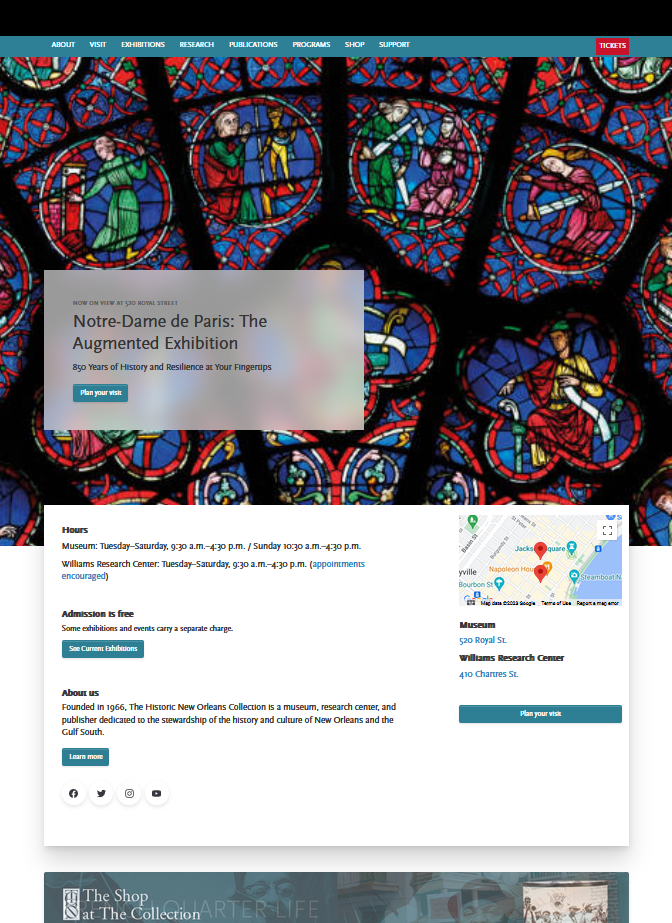
Original Website
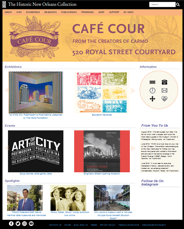
Current Website